Maroun
Chedid is a renowned Lebanese chef in the Middle East and Gulf regions
whose brand needed a complete revamp to answer to its vision of
expanding internationally. His business module includes a catering
service, a consulting service and a school of culinary arts.
With an
Endorsed Brand strategy in mind, all 4 brands were designed to look
different while retaining a common thread in terms of aesthetic and
thought.
━━━━━━━━━━━━━━━━
➊
The Maroun Chedid Identity➙
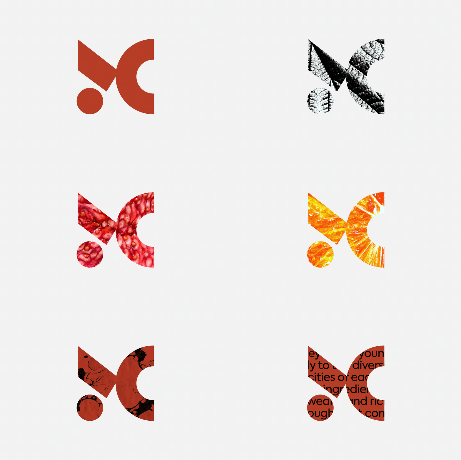
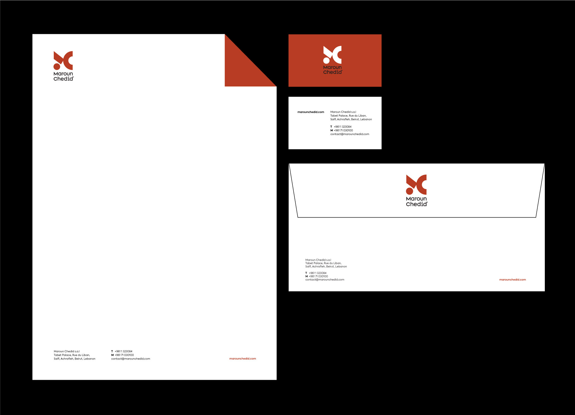
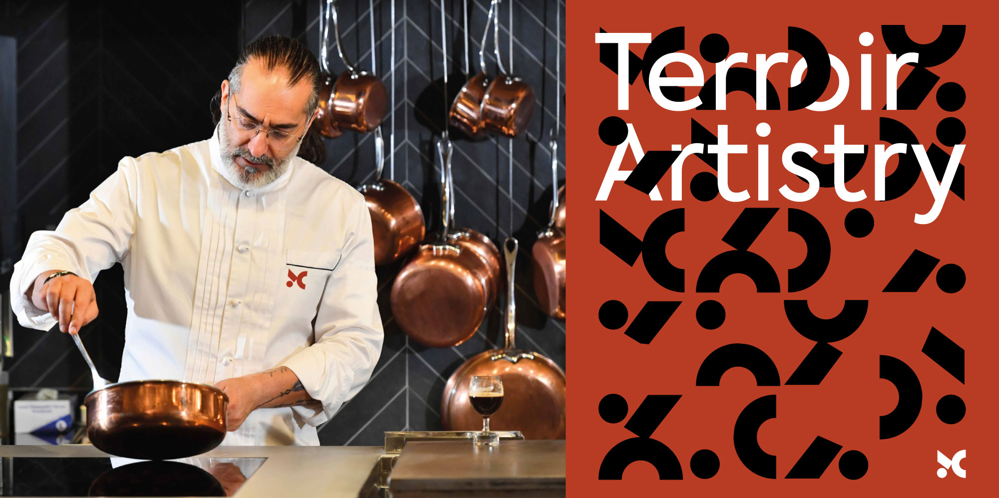
The MC monogram is inspired by how different simple ingredients (represented here in basic geometric forms) can come together to create a piece of art. It represents the chef's bold, modern and exquisite approach to cooking and is designed to be a dynamic container that can express the 4 different pillars of the brand: Terroir, Authenticity, Inventiveness and Artistry.

━━━━━━━━━━━━━━━━
➋
Citrus Identity➙
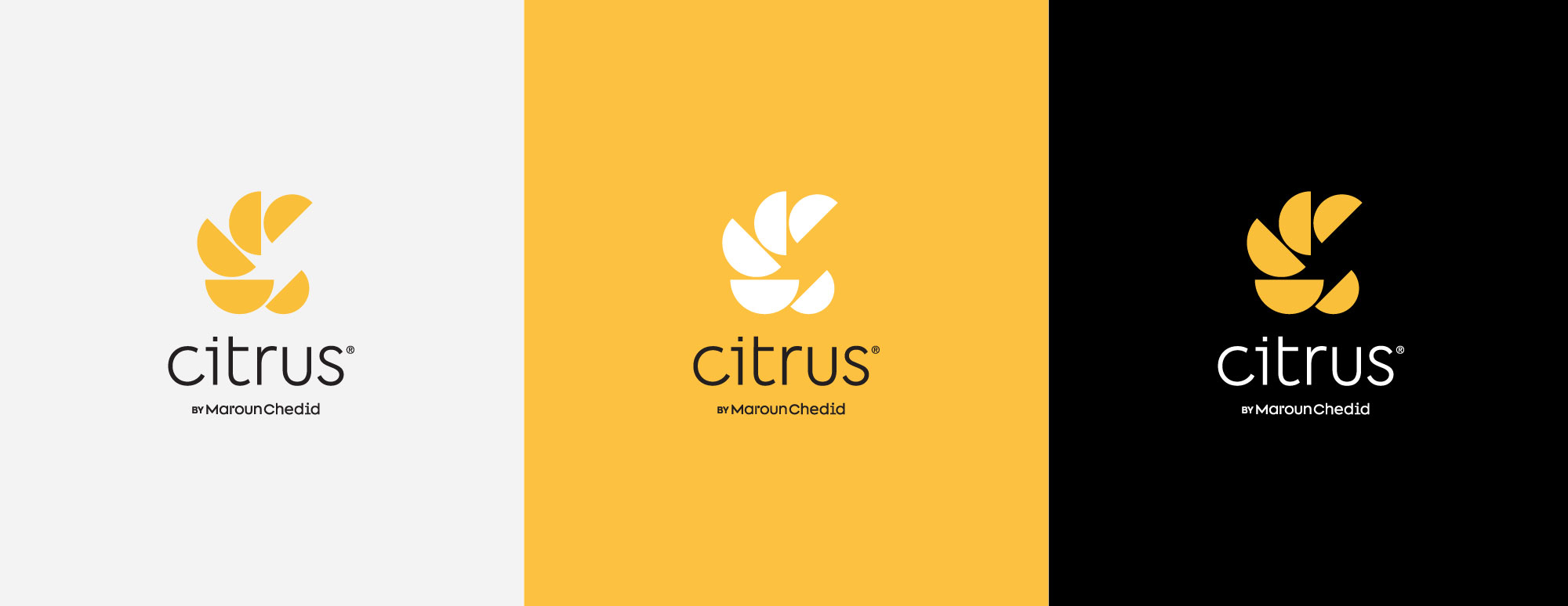
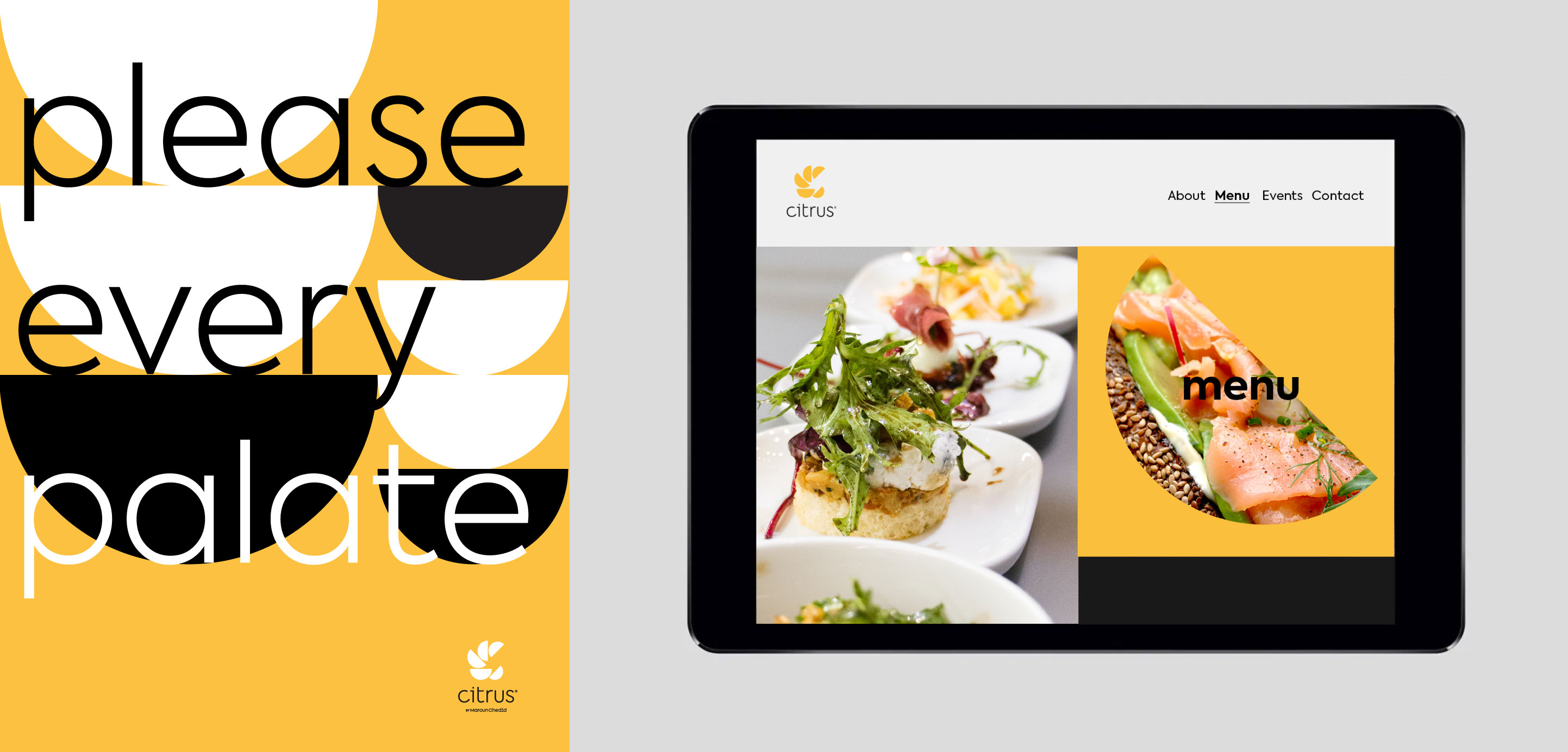
Citrus is a catering service by Maroun Chedid. Similar to the mother brand, the monogram is created with geometric forms inspired by a serving bowl as well as the citrus fruit. The semi-circles come together to create a dynamic C which reflects the joy and liveliness of coming together around food.
━━━━━━━━━━━━━━━━
➌
Copper Trey Identity➙
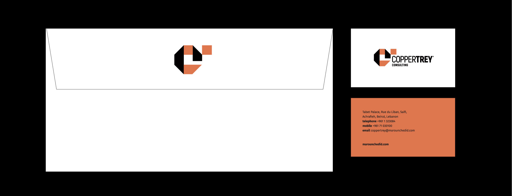
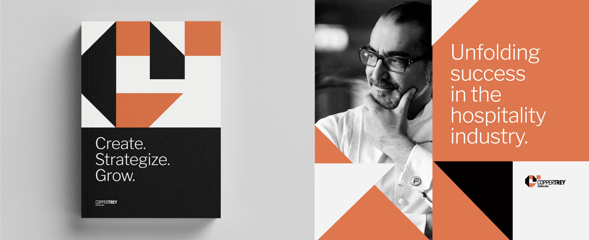
Copper Trey is the consulting unit by Maroun Chedid. Within the same concept of using geometric forms to create a monogram, the C and T come together to reveal an unfolding of success and opportunities. The result exudes strength, trust and creativity.

━━━━━━━━━━━━━━━━
➍
School of Culinarty Arts Identity➙
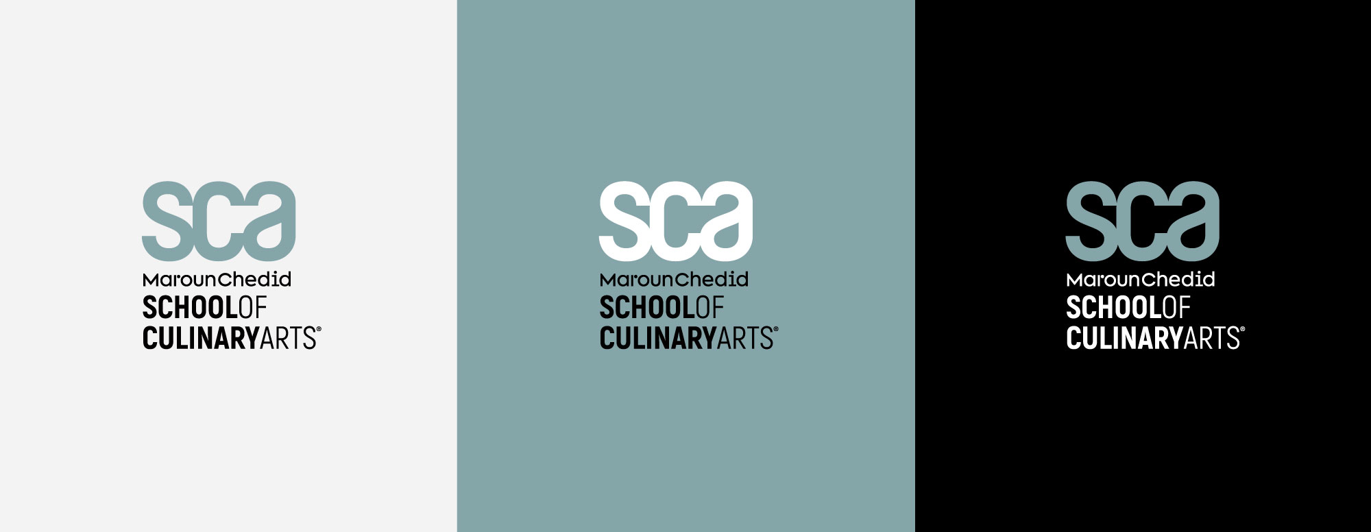
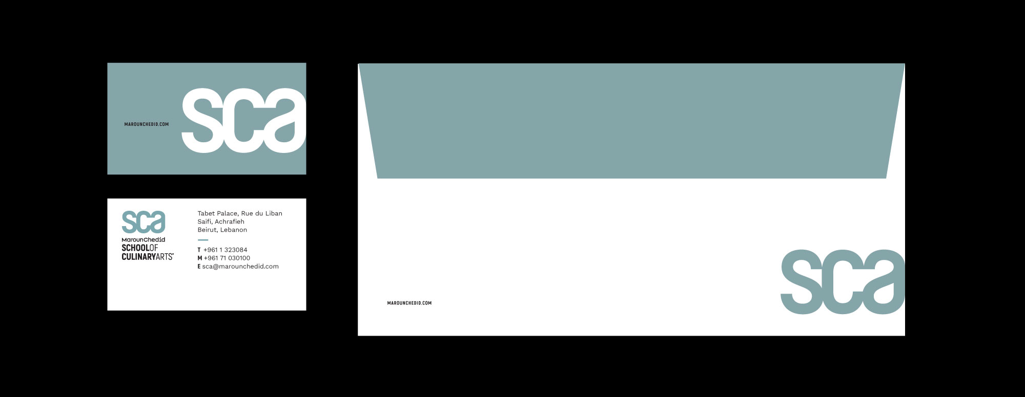
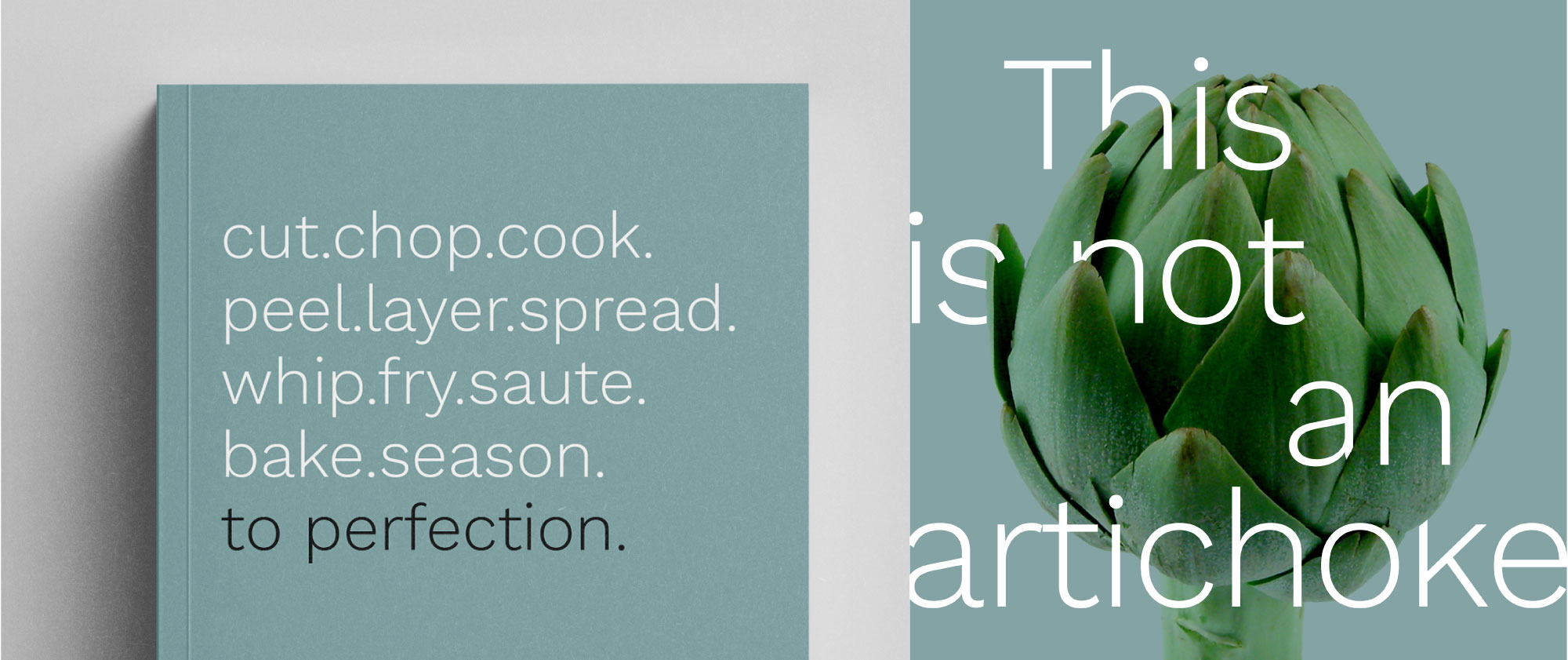
SCA (school of culinary arts) offers programs for both foodies and professional chefs. A more serious, academic approach was needed for this sub-brand to convey a confident and straightforward personality. The geometric forms are replaced here with a search for symmetry abetween the letters, similar to a chef's way of finding a perfect balance between flavors.
©2020 Nisrine Sarkis
nisrine.sarkis@gmail.com

